'Career'
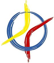
In spring 2007, the graphic artist Nino Werthmann (external link, opens in a new window) from Regensburg created this drawing, through which an outwardly effective symbol was 'born' for the chair, which equally wants to stand for the multi-layered concerns of the chair's work.
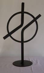
The point of reference is a sculpture that student teacher Maria Zistler created in the 2006 summer term in the seminar 'Symbol Didactics Exemplary: Exploring and Designing the Symbol 'Cross''. In an examination of the symbolism of the cross, the New Testament background and modern art, students from various teaching degrees designed their own depiction of the cross and thus interpreted their own view of the events surrounding the cross and resurrection. Maria Zistler (LA Realschule) realised her idea of the cross in the blacksmith's workshop with the help of Josef Sedlmeier, a former lecturer and blacksmith from the Department of Art Education at the University of Regensburg, who was 'hands-on' in the truest sense of the word.
Standing cross by Maria Zistler
"This ring holds the cross together just as the cross of Jesus holds our community together and is a sign of this community. The circle also shows the sun, which gives us light, just as Jesus gave us light through his death on the cross. The actual cross is split in the centre. This is intended to express Jesus' suffering on the cross, as in my opinion he was certainly inwardly torn at the end as to whether his severe suffering and agony on the cross was really the right thing to do. As if we don't know in the end whether what we did was right."
(Maria Zistler)
- height approx. 46 cm, width
- approx. 30 cm, square steel
- 12 and 16 mm,
- Plate 3 mm, cold oil
In Nino Werthmann's graphic design studio(external link, opens in a new window) (external link, opens in a new window), the sculpture was developed into a drawing that took up the basic idea and moulded it in such a way that it could be printed and presented.
Associations
Attentive observers will quickly notice that the choice of colours is close to those of the World Youth Day in Cologne in 2005 - an intention that was not intended or commissioned, but overall an appropriate and successful choice of colours, as the scientific effort to promote religious learning is committed to the first addressees of all religious education efforts: children, young people and adults.
In addition to the stylised depiction of the cross, which is certainly dynamic, religious educators could also associate a correlative basic idea - two perspectives, separated from each other, and yet directed towards each other, two movements that approach each other, do not mix and yet are related to each other.
The graphic also contains 'multidimensionality': yellow and red arc ends enter and leave the inner circle in different directions, the circular form embraces the whole and adds an element that is completely separate from the arcs.
After all, the arcs have neither beginning nor end - we do not know what will be inside the inner circle after the approach, we do not know the changes of direction that were and will be outside, we only realise that this circle does not want to bind the dynamic itself, but nevertheless provides a place of being surrounded in the other emptiness.